Color POP
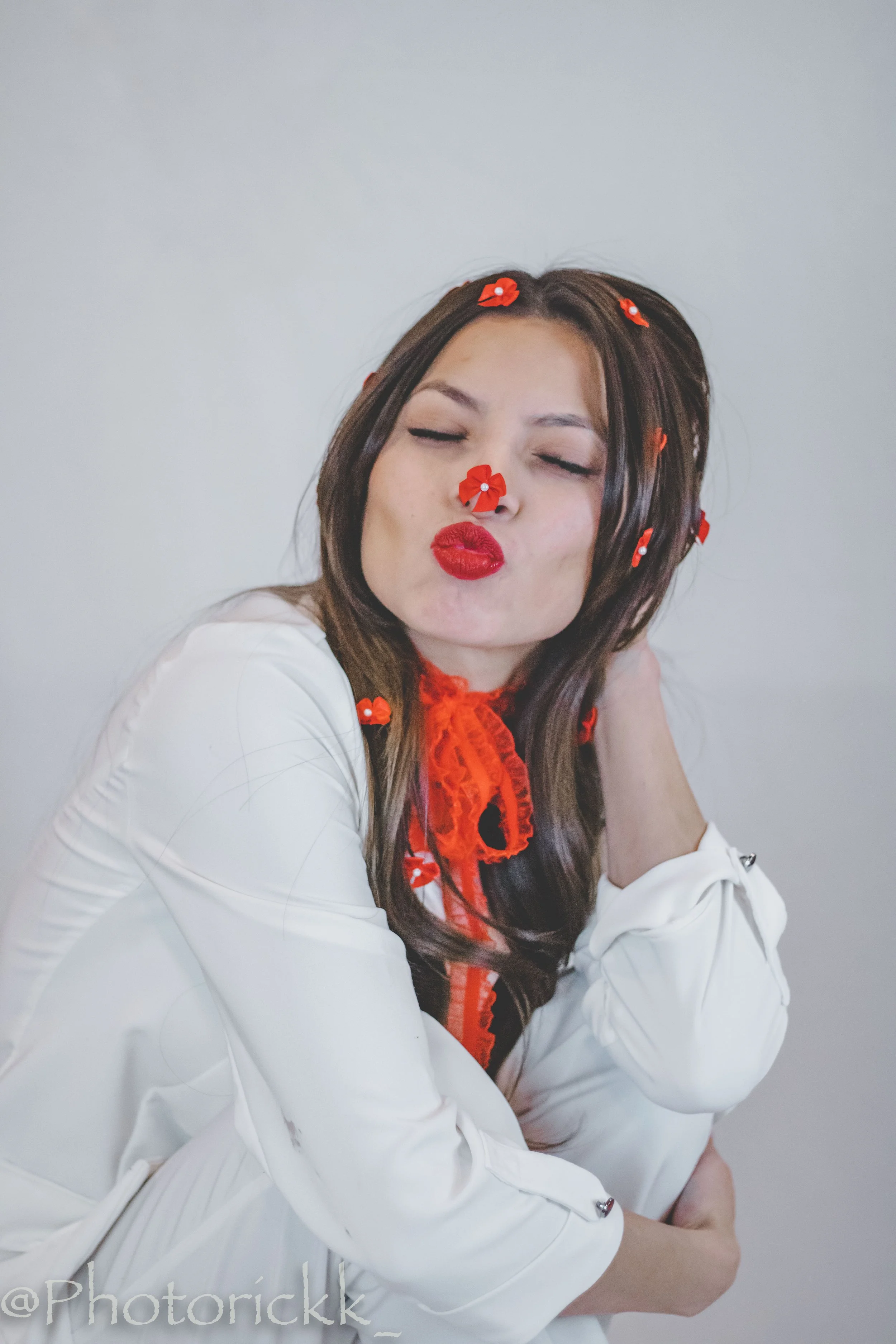
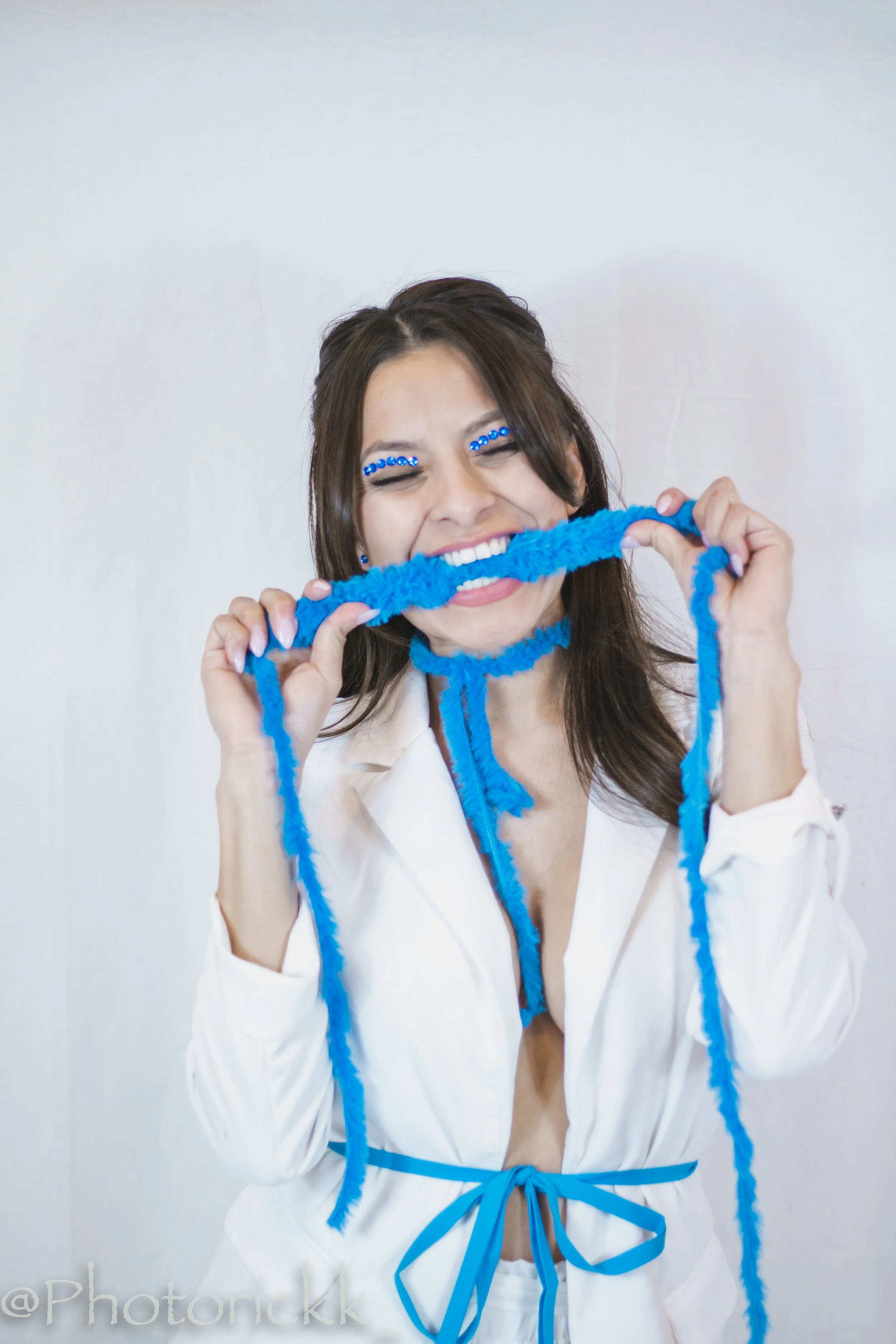
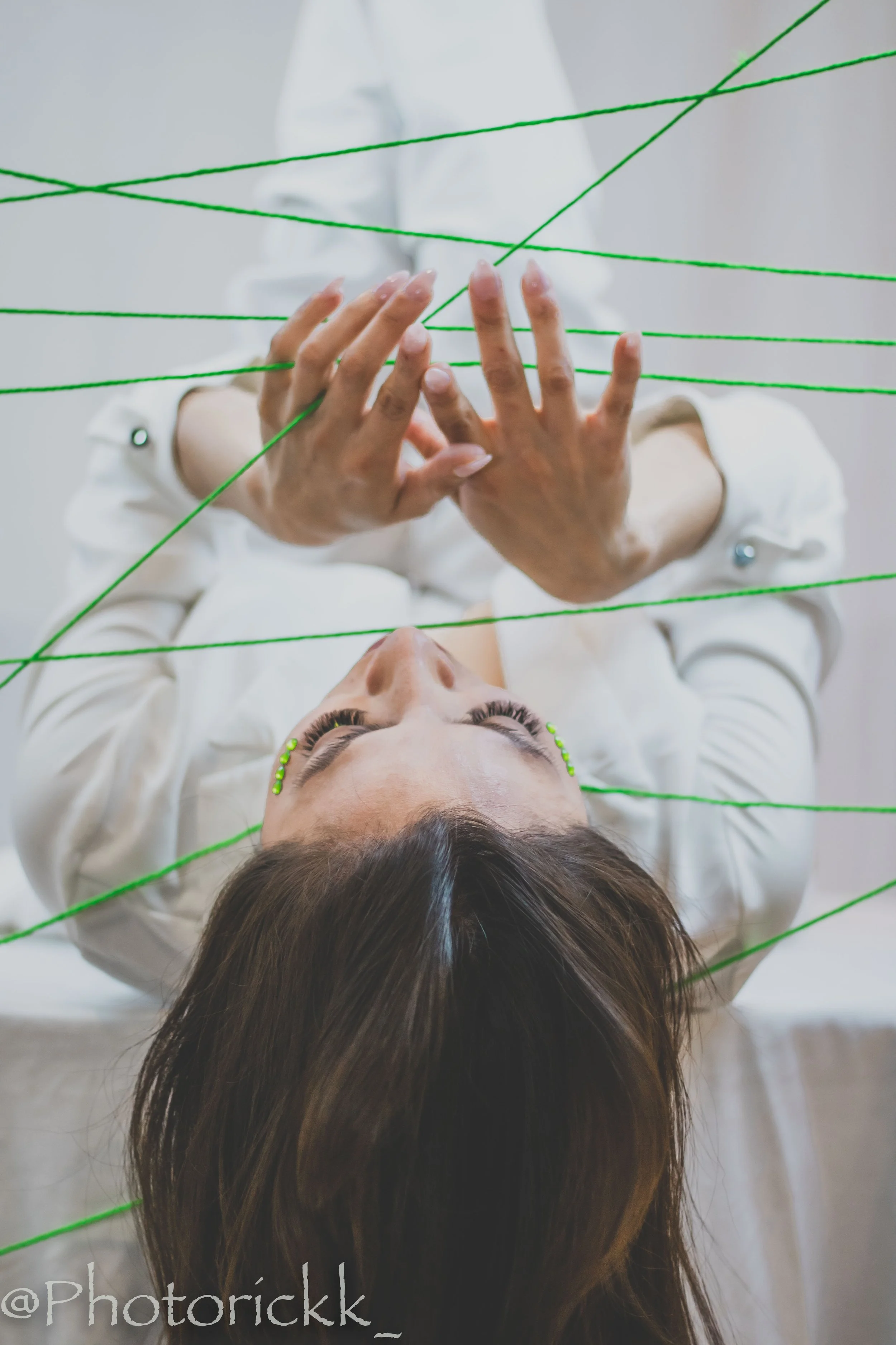
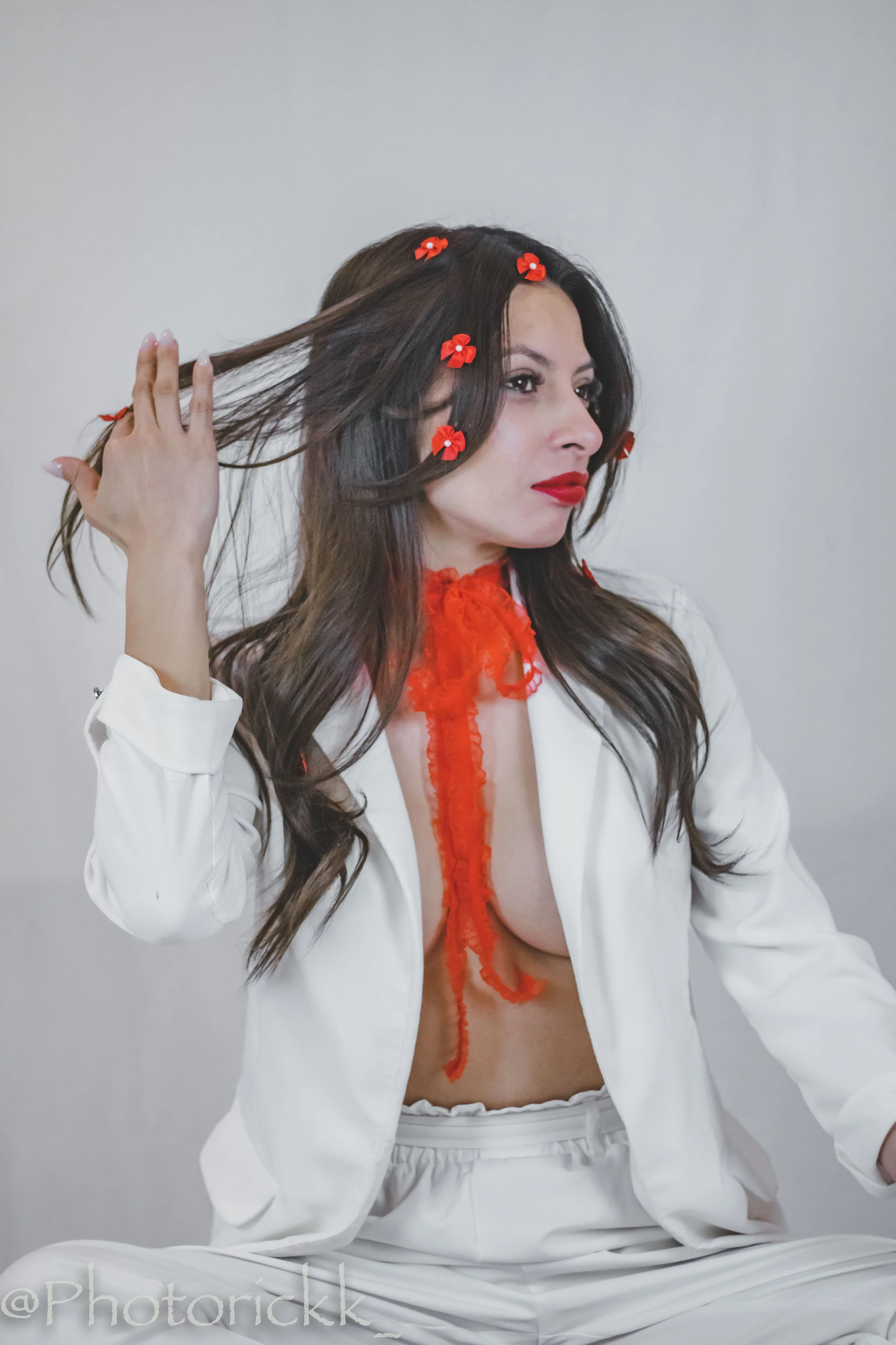
For this series I wanted to get out of my comfort zone and try something a little bit different. This semester has been the first time that I have begun to shoot in a studio scene, I would always just go out and shoot in various locations but for this project I wanted to experiment and play around with props and colors. The main concept of this photo shoot was to create a photo that had a pop of color in a monochromatic scene. In a lot of my photography, I am used to color always being there I have never tried to focus on making the color the main subject of a photo, in most of my photo's color is just something that is always there, something that I am always used to seeing. That is why with this project I wanted to push myself and try to create a series of photos where not only is the model the subject but also the color. Going about this project was very frustrating for a couple reasons because I had to create a different theme for each color, it was not like my regular portrait photography where I would just go somewhere and take photos of the model and be done. I had to really think about the kind of objects and materials that I wanted to use, and how I was going to use them so that each photo that I took was not the same, just with different colors. I decided to choose the main six colors of the rainbow because I still wanted to connect all the photos together and have a sense of unity I just felt like if I were to use random colors, then I feel like it would have not had the same effect it does now in my opinion.